Introduction
Soft-proofing is the capability to see how your photos will appear when printed. It gives you an idea of the output quality before you click Print. Ideally, you can use the soft-proof information to further edit your image and compensate for changes imposed by your printer or paper's performance limitations.
It is important to note that you should only use a calibrated and profiled monitor when soft-proofing. (look to companies like Datacolor for your monitor profiling needs).
Some more tips:
- Wait for your print to dry fully, 20 minutes to an hour, before comparing it to the monitor.
- Be sure to illuminate your print properly during this comparison. Be in a brightly lit room, use a color-balanced light next to your monitor, or bring the print to a window.
- Comparisons should be limited to color and tone accuracy.
Photoshop

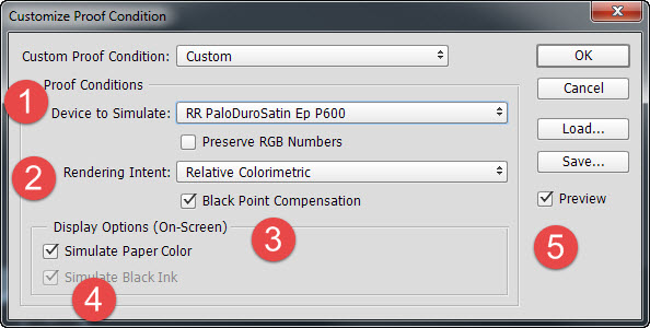
To begin the soft proof process, go to Photoshop menu: View > Proof Setup > Custom

1. Device to Simulate - choose the printer profile you would like to soft-proof. Profiles are obtained from Red River Paper's profile Library.
2. Rendering Intent - Start with Perceptual. Your other option for inkjet printing purposes is Relative Colorimetric. Rendering intent dictates how Photoshop will handle out of gamut colors.
Perceptual aims to preserve the visual relationship between colors so they are perceived as natural to the human eye, even though the color values may change. It is suitable for images with many saturated, out-of-gamut colors.
Relative compares the extreme highlight of the source color space to that of the destination color space and shifts all colors accordingly. Out-of-gamut colors shift to the closest reproducible colors in the destination space. Relative preserves more of the original colors in an image than Perceptual.
3. Black Point Compensation - Leave this option checked.
4. Simulate Paper Color - Try turning it on and off. This feature maps the "White Point Tag" in your profile. When this option is left off, the maximum white (RGB=255) in the file is mapped to the maximum white of the monitor (MonitorRGB=255). So the white you will see is the white point of your monitor, not the print. When turned on, the simulation uses the paper's white point. In short, the system tries to replicate the actual white shade of the paper you are using.
Simulate Black Ink maps the Black Point Tag inside the profile to the monitor display to reproduce the actual black density of your print. It is defaulted ON if you choose Simulate Paper Color.
5. Preview—If you check the Preview option, you will be able to see the soft-proof applied and the change behind this dialog.
Click OK to apply the soft-proof.
TOP TIP—Keep in mind that the soft proof is not an edit to your image. Applying a soft proof does not alter the file in any way.
TOP TIP - Once you click OK, the dialog will close and you will be back at your image, viewing in soft-proof mode. To switch back and forth from soft-proof to a non-proofed view, press CTRL+Y on your keyboard. (Command+Y on a Mac).
Take care when using these display option proofs. The results can often look odd at first blush. One good tip from Giorgio Trucco at Outbackphoto.com is to look away when applying the proof. Give it a good 20 seconds, and then look at your monitor. This should be a good preview of your final output. For a more in-depth presentation on Photoshop soft proofing, Check Out This Presentation by Cambridge in Colour.
Lightroom
 >
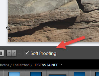
>With an image open in the Develop module, select the Soft Proofing box in the toolbar.
The preview background turns white, a Proof Preview label appears in the upper-right corner of the preview area, and the Soft Proofing panel opens.

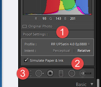
1. Choose the printer profile you would like to soft-proof. Profiles are obtained from Red River Paper's Profile Library.
2. Intent - The rendering intent determines how colors are converted from one color space to another.
Perceptual to preserve the visual relationship between colors so they are perceived as natural to the human eye, even though the color values may change. Perceptual is suitable for images with lots of saturated, out-of-gamut colors.
Relative compares the extreme highlight of the source color space to that of the destination color space and shifts all colors accordingly. Out-of-gamut colors shift to the closest reproducible colors in the destination space. Relative preserves more of the original colors in an image than Perceptual.
3. Simulate Paper & Ink - This feature tries to simulate the true white tone of the paper you are using. The system obtains this information from the profile data, which contains the paper's white point. The ink simulation uses the "Black Point Tag" inside the profile. It attempts to reproduce the black density of your printer, paper, and ink combination.

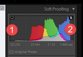
1. Show/Hide Monitor Gamut Warning - Colors outside your display’s color capabilities appear blue in the image preview area.
2. Show/Hide Destination Gamut Warning - Colors outside your printer’s rendering capabilities appear red in the image preview area.
Colors outside the gamut of both the monitor and destination device appear pink in the image preview area.
To edit your photo and bring it within a desired color space, click Create Proof Copy. Lightroom creates a virtual copy that you can adjust to print. Then, make your adjustments.
Last updated: November 15, 2024


